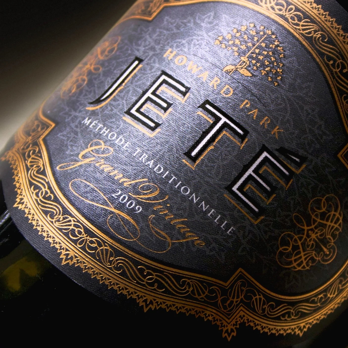
Howard Park has long been inspired by the world of ballet thanks to its family roots. The entire Jeté sparkling range is an ode to the professional dance careers of Jeff Burch’s siblings: David and Lesley.
David Burch had an illustrious history as principal dancer with the Australian Ballet from 1977 – 1983. His sister Lesley worked with the WA Ballet Company from 1972 – 1977. Both eventually fell into wine at Howard Park, with the former as the long-serving Vineyard Manager of the Leston property (now semi-retired), and the latter as Brand and Sales Ambassador.
Crafting the Jeté range has been a feat years in the making, requiring cohesion, dedication and patience across Howard Park’s team. The Mount Barrow vineyard in the Great Southern is the starting point, from which high acidity Pinot Noir and Chardonnay grapes are grown in ancient soils.
Years of fascination with Chamapagne lead Jeff Burch to seek out the expertise of methode traditionelle authority Allan Stanbury, select highly specialist equipment and launch the Jeté project.
This dedication and commitment to raising the standard for quality has resulted in multiple national and international awards, including the Best Australian Sparkling Wine 2017 award at the Champagne and Sparkling Wine World Championships.
Four methode traditionelle sparklings have been crafted after this ballet tradition since 2012, including a Jeté Brut Blanc, Rosé, vintage Extra Brut Cuvée and most recently, the Petit Jeté.
For over 20 years MadFish is one of Western Australia’s greatest selling wine brands and continues to perform strongly in the market. Since 1996 Pete McDonald has carefully designed and evolved the brand and associated packaging and marketing materials. Our latest chapter on MadFish...
CHRISTOU Design Group has developed a reputation nationally and internationally for high quality service, innovative design, precise documentation and expert delivery of projects at every scale.
It’s these qualities that made rebranding Christou not only a pleasure but second nature for us.
Owners, Sue and John, of Angelicus Wines moved to Moss Vale, NSW to open their own Wine Lounge and Wine Merchant. ‘Mosaic’ was to be the overarching name. Since the word ‘Mosaic’ means ‘to make a picture of coloured pieces of tile, stone or glass’ it seemed fitting to design a brand that was exactly this. It was time to have some fun! The ‘picture’ component of the logo in this instance became a mosaic carafe for the Lounge and a mosaic wine bottle for the Merchant. The scope of work included: external and internal signage, loyalty cards, stickers for packaging and local magazine advertising.
Founded in 1969, Moss Wood is internationally regarded as one of the finest estates in Australia.
Since 2007 we’ve been very fortunate to work with Moss Wood to carefully guide, design and manage all the label and package design, marketing and communications material.
Bottle images courtesy of Frances Andrijich Photography www.andrijich.com.au
Samual Wright Design is a multi-disciplinary industrial design studio. Sam designs everything from bespoke furniture to luxury Super-yachts that are now operating around the world.
Making vermouth is an interesting process of ‘steeping’ many unusual herbs and botanicals in an alcohol base and then adding wine results in a multi-layered bouquet and complex flavour profile. Perfect inspiration for the label design.
The ‘Petit Lot’ series has been a privilege to work on. The initial design process begun with a well thought out brief by the client – to tell a story of each wines’ connection to the land through drawings – by artist and illustrator, Trilby Glen. Trilby’s illustrations have remarkable detail and appeal so it became obvious to make the image as large as possible on the label. The clients idea of moving all text and mandatory info out of view was perfect. With careful design considered by us: positioning the image; choice of background colour; classic fonts; and careful attention to printing techniques; the Limited Edition ‘Petit Lot’ series is well on the way to becoming a timeless label design.
www.trilbyglen.net
@mustard_seed_art
@trilby_glen
Koolkuna is a womens refuge in the eastern suburbs of Perth and had very little branding presence amongst stakeholders and the community. We partnered with Marketing for Change to rebrand Koolkuna’s identity. A large percentage of the community who seek Koolkuna are Indigenous so it was important to reference some cultural aspects in the brand. In this instance we used Indigenous symbolism – the two ‘o’s’ represent meeting places moving from one ‘not so safe place’ to a very ‘safe place’.