izgi yapıcı
izgi yapıcı
Designer .. Creative Director
 
 
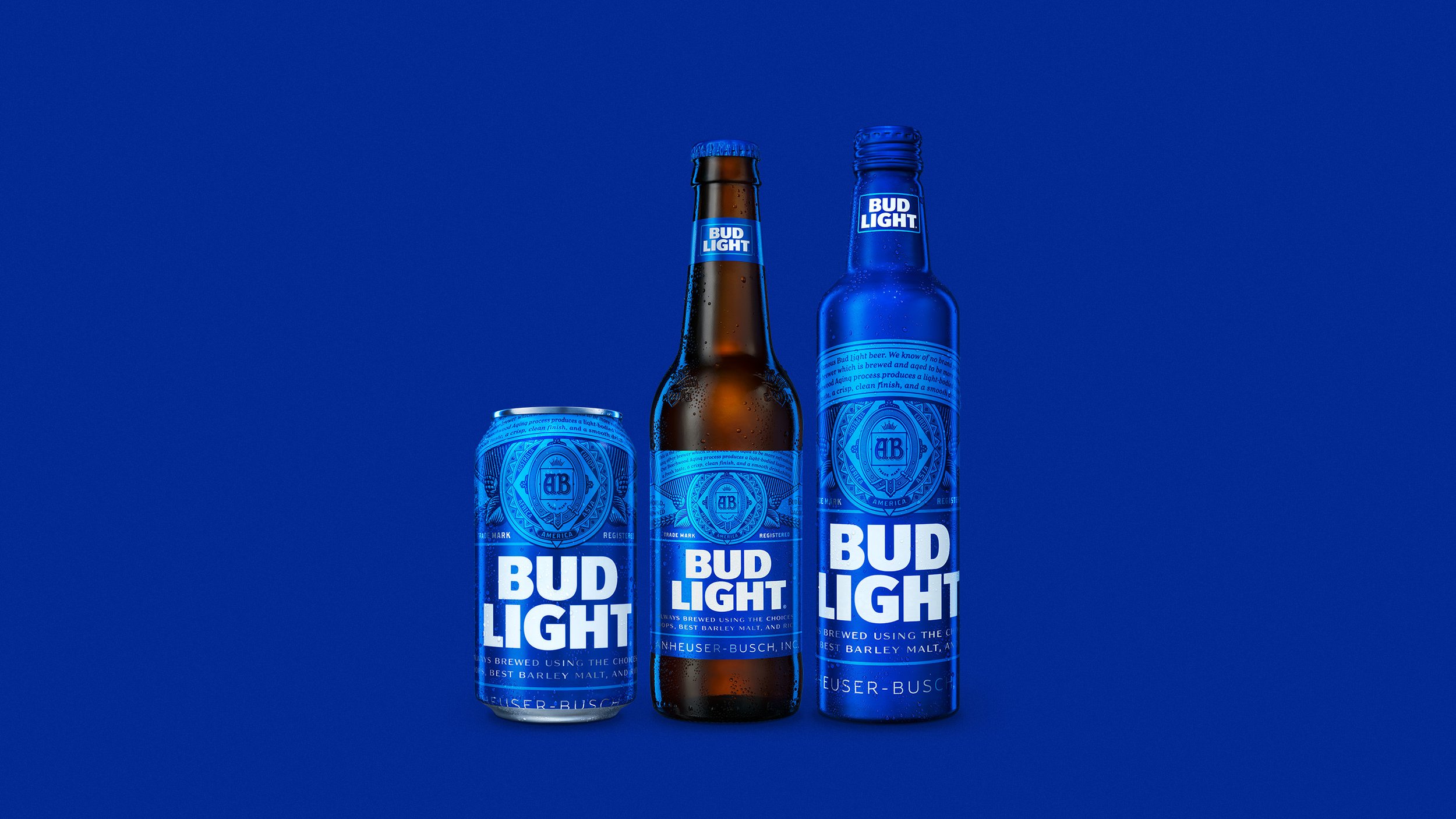
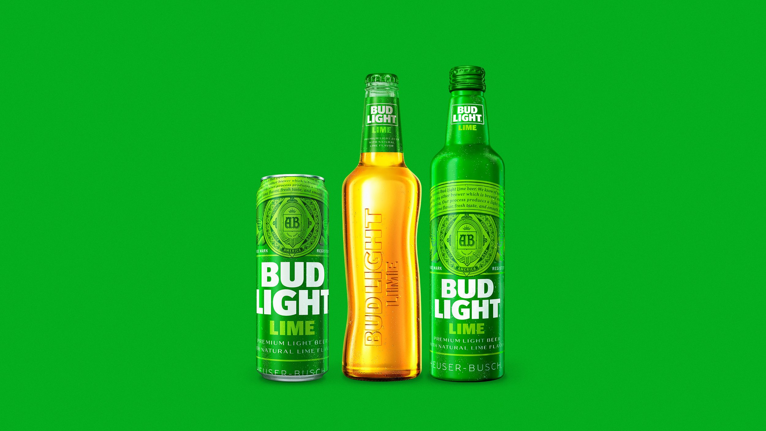
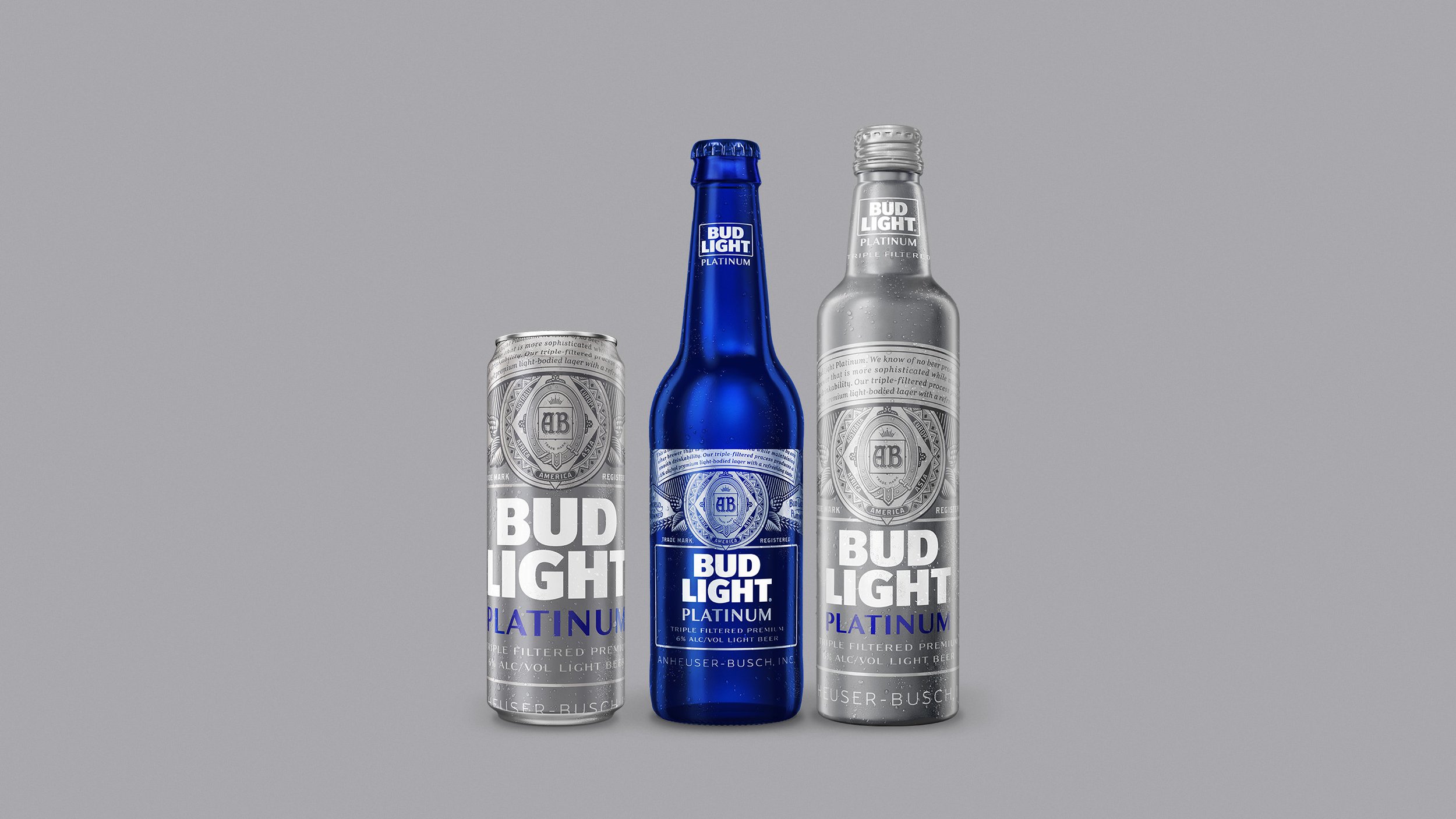
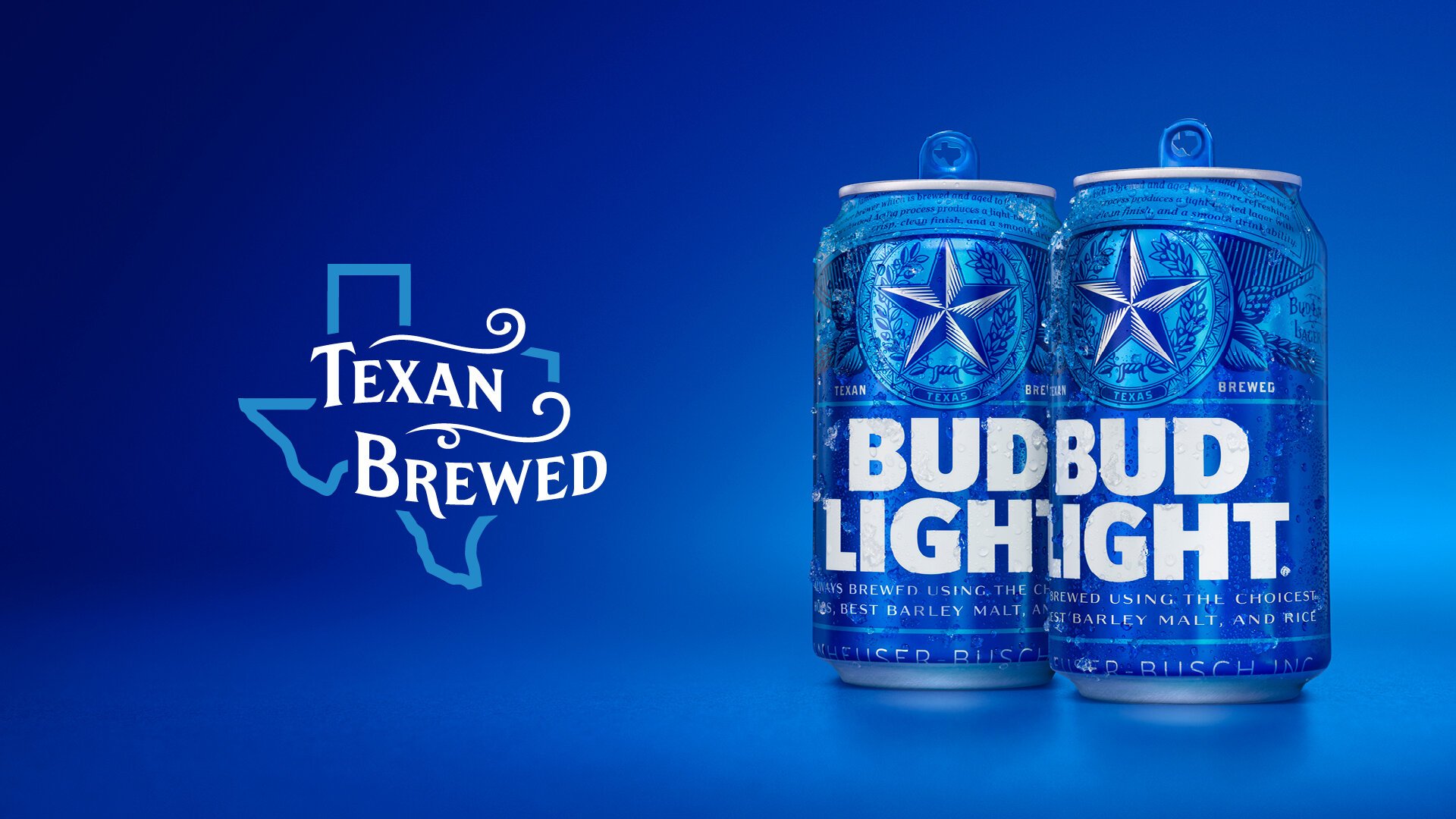
  • Introduced in 1982, Bud Light is a premium light lager with a superior drinkability that has made it the best-selling and most popular beer in the United States. However over the years, the Bud light brand had become diluted.

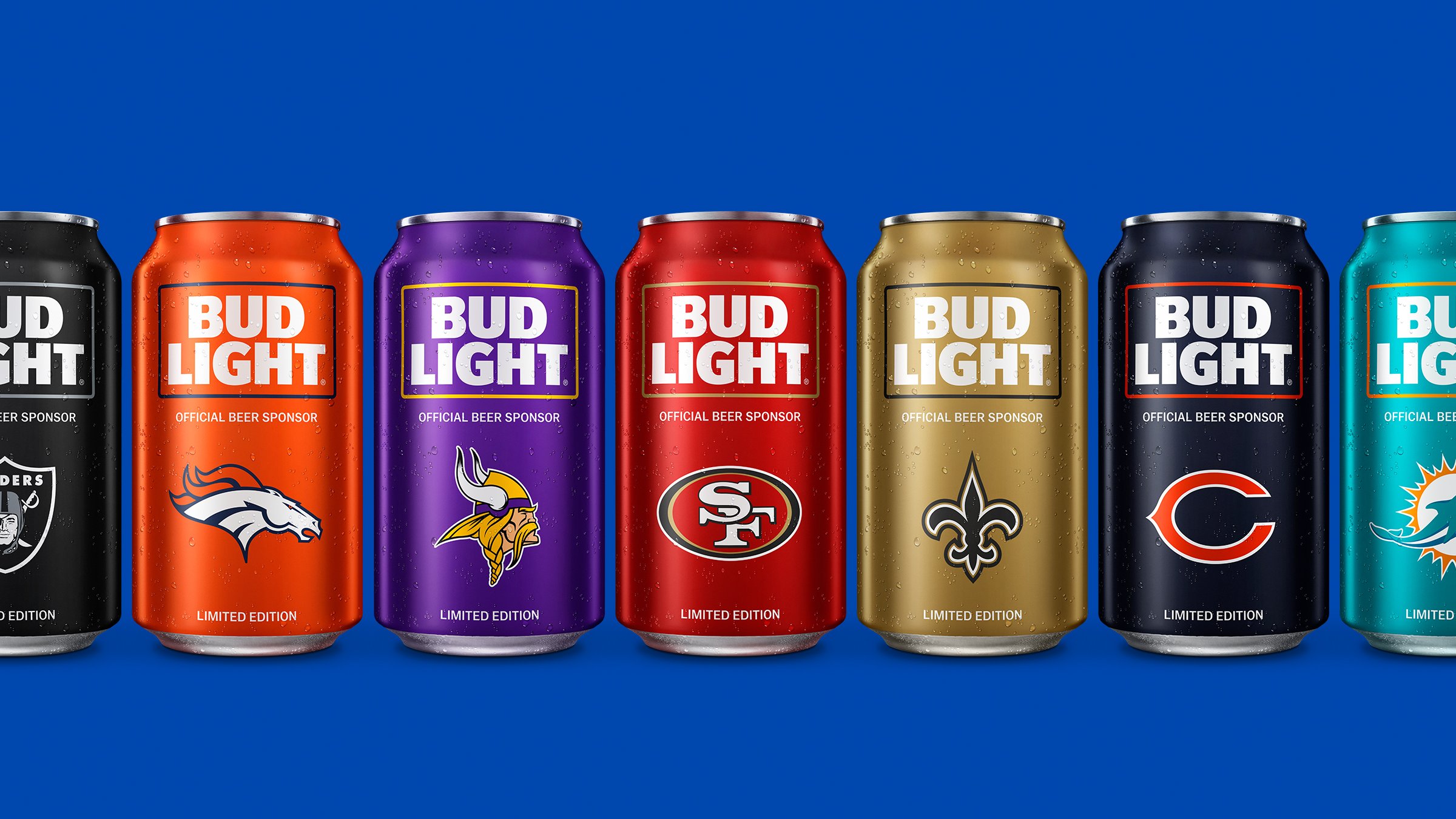
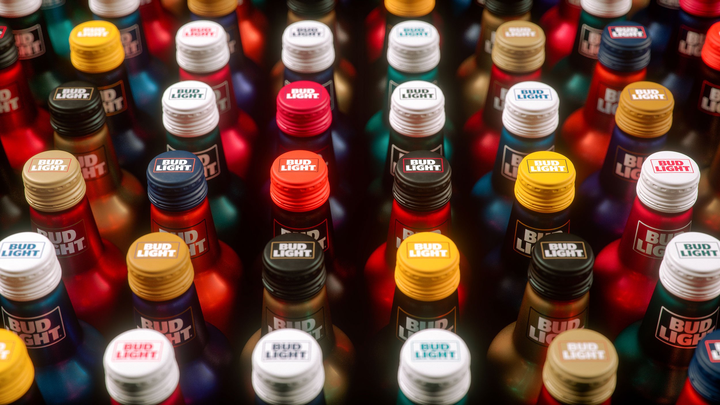
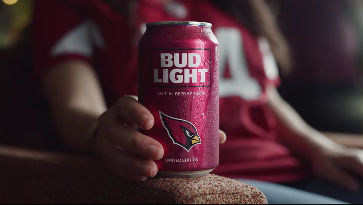
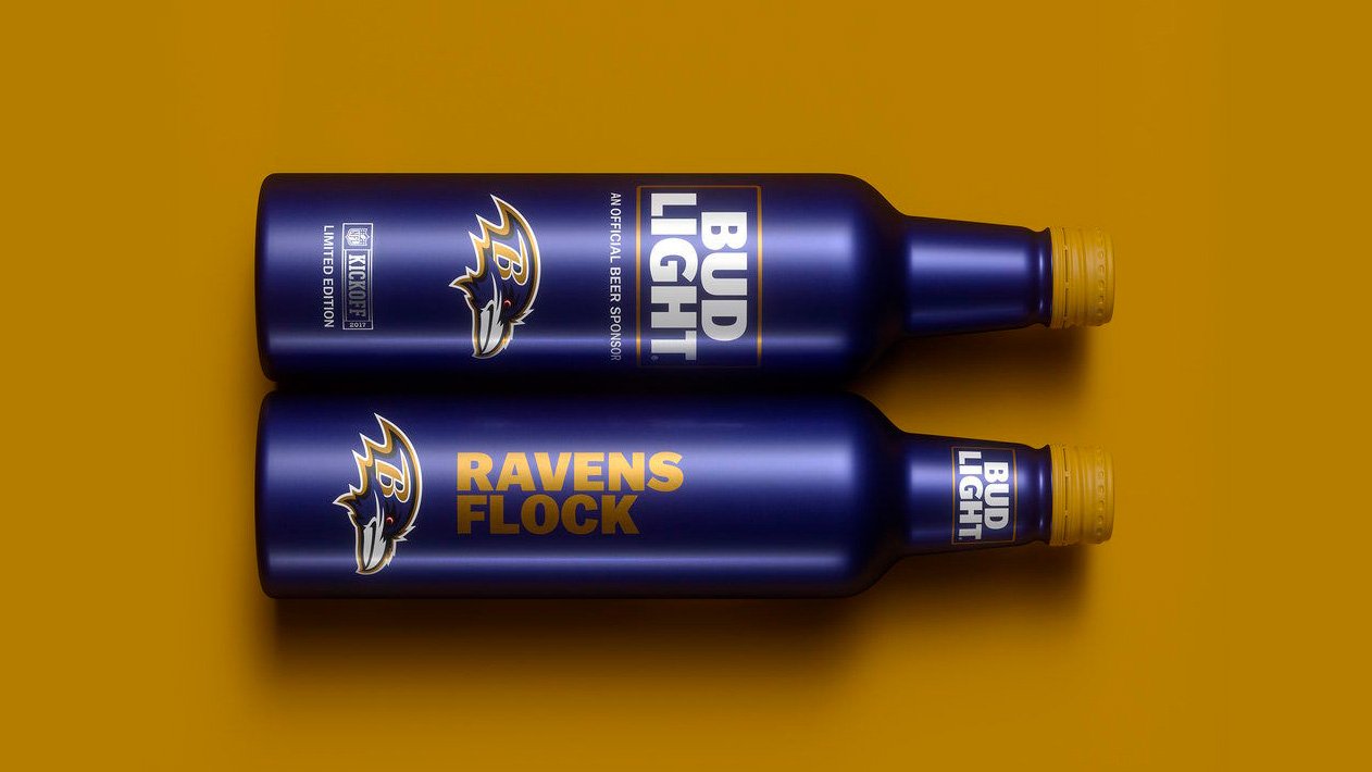
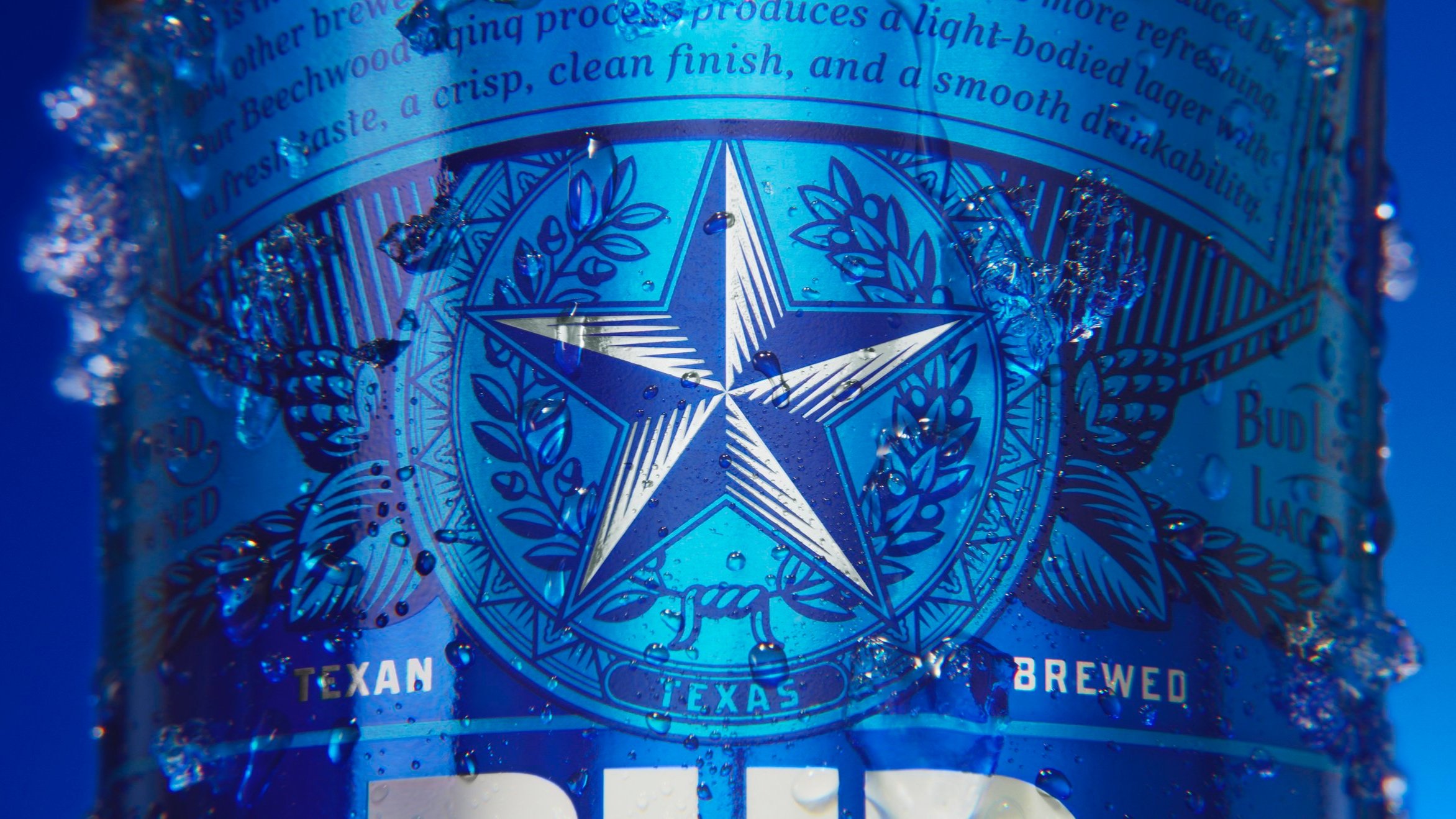
    We reintroduced Bud Light with an unashamedly bold, confident identity. The design emphasized the attributes that established the brand as the country's most popular beer: premium ingredients, a crisp, clean finish and a smooth drinkability.

    After rolling out the identity, we visited the archives in St. Louis to get inspiration to expand the visual identity system. This inspiration drove us to develop a new custom typeface, photography style, brand icon illustrations, and overall guidelines for a new fresh system.

  • agency .. Jones Knowles Ritchie

    design .. Tosh Hall, Danny D'Arcy, Andy Baron, Robert Medkeff, Augustus Cook, Cyrus Blais, Adam Howard, CJ Draper, Izgi Yapici

    multimedia .. Justin Sottile

    typography .. Ian Brignell, CLUB

    photography .. Martin Wonnacott

    client management .. Josh Griffin, Zach Anziska

  • Clio Awards .. Brand Design .. Shortlist .. 2017

    Graphis .. NFL Packaging .. Gold Award .. 2018

    The One Show .. Rebranding .. Gold Pencil .. 2017

    Pentawards .. Brand Identity Program .. Bronze Pentaward .. 2017

    Pentawards .. Limited Edition .. Bronze Pentaward .. 2017

    PRINT Magazine .. Rebranding .. Regional Design Award .. 2018

 
  • Casey’s, home of the famous breakfast pizza, was founded in 1968 in Boone, Iowa, as a gas station and convenience store. By 2020, it was the fourth-largest convenience store and fifth-largest pizza chain in the US with 2,200+ stores and a 16-state footprint. Over its more than 50 years of existence, Casey’s has become more of a cultural icon than a gas station with a cult following in the communities it serves, mostly in small towns and rural areas in the Midwest.

    But as the business has evolved, the logo stayed the same, creating a disconnect between the modern in-store, app and online experience and the brand. Our role was to carefully update the brand to bring it in line with the new products and experiences that Casey’s now offers, while retaining its unique heritage.

    The resulting brand evolves the barn, elevates the presence of the weathervane, and uses a customized font for cohesion with other visual elements and legibility in all sizes. These three logo components create a brand expression that is connected to the Casey's heritage and that can flex across the customer journey in new and exciting ways, from highway signs to the app.

    One of the first applications of the new brand look was packaging for pizza and fountain drinks and a new line of private label products. The design challenge was to develop a packaging system that would adopt to the new Casey's brand look and compete with the leading brands within the product category.

  • agency .. Interbrand

    client .. Megan Elfers, Eric Long

    design .. Oliver Maltby, Izgi Yapici, Spencer Seligman, Eddy Lee

    implementation .. Jean Campbell

    typography .. Jesse Ragan

    multimedia .. Fakery

    client management .. Anna Young

  • Art Directors Club .. Branding Systems .. Shortlist .. 2022

    Art Directors Club .. Rebranding .. Shortlist .. 2022

    Brand Impact Awards .. Bronze Award .. 2021

    Brand New .. The Year in Review .. The Best #4 .. 2020

    Brand New .. The Year in Review .. Best in Packaging #5 .. 2020

    Brand New .. The Year in Review .. Best in Wordmarks #5 .. 2020

    Graphis .. Logo .. Gold Award .. 2021

    Graphis .. Rebranding .. Silver Award .. 2021

    Graphis .. Packaging .. Silver Award .. 2021

    Interbrand Iconic Awards .. Packaging .. Winner .. 2021

    One Show .. Rebranding .. Shortlist .. 2022

    Red Dot Awards .. Brand Design .. Reddot Winner .. 2021

    Transform Awards .. Best Brand Consolidation .. Gold Award .. 2021

    Transform Awards .. Best Use of Packaging .. Silver Award .. 2021

    Transform Awards .. Best Use of Typography .. Bronze Award .. 2021

    Transform Awards .. Best Brand Evolution .. Bronze Award .. 2021

    Transform Awards .. Best Brand Experience .. Highly Commended .. 2021

 
  • The healthcare industry and prescription management process in America is complicated and frustrating. From a lack of transparency in drug prices to unpleasant pharmacy interactions, the process is disorganized and highly inconvenient. Hippo’s goal was to change just that. The team at Hippo wanted to disrupt the sterile space of healthcare technology with a bold & fun identity that launches the brand as the one simple destination to Fill Better.

    We created a visual identity system that brings to life what the brand is truly setting out to do — disrupt a complicated industry with honesty and a spirit of playfulness. The custom-crafted logo that cleverly employs serifs to embed a pill, representing the entire brand, forms the foundation of a vibrant system. From the catchy and playful name, to the bright & vibrant color palette married with an approachable sans serif typeface — the identity is bold, confident and full of fun. A witty yet informative tone-of-voice and the bespoke 3D illustrated characters infuse energy and dynamism to allow the brand to stay true to itself and the consumers.

  • agency .. Jones Knowles Ritchie

    design .. Tosh Hall, Robert Medkeff, Cyrus Blais, Jennifer Yung, Catherine Wyatt, CJ Draper, Izgi Yapici

    strategy and verbal .. Willie Miesmer

    illustration .. Jean-Pierre Le Roux

  • Clio Awards .. Brand Design .. Silver Winner .. 2018

    Communication Arts .. Identity Program Design .. Award of Excellence .. 2018

    Graphis .. Branding .. Silver Award .. 2018

    Graphis .. Logo .. Merit Award .. 2018

    The One Show .. Branding .. Silver Pencil .. 2018


  • Adobe's mission of changing the world through digital experiences would never be possible without its 22,000+ employees around the globe, who are rallied around it. However, its existing employer brand communications lacked the luster of the Adobe brand and were not cohesive across programs.

    Our role was to create a new employer brand expression that reflects the magic of what makes Adobe unique across everything they do. The challenge was aligning it with the new look and feel of Adobe that united its brand experiences across corporate, cloud and product communications, and matched the inspiring, progressive, creative experience of working for Adobe.

    The result was a differentiated, fresh and inclusive employer brand with visual expression that aligns with Adobe’s commitment to creativity.

    Two core visual elements define the new Adobe employer brand — photography of employees and a multi-colored gradient. Integrating real-life images of Adobe employees* enables us to showcase them at the center of the system, reinforcing the connection between the employees and the brand. And the gradient, multiple colors moving seamlessly from one to the next, visually represents creativity, collaboration and transformation all at the same time. The gradient always begins with red, the core color of the Adobe brand, and incorporates additional colors from Adobe’s secondary color palette. These gradients are fluid and flexible by design — representing the wide range of people and perspectives that distinguish Adobe from others.

    *The employee images used on this case study are stock images, not actual Adobe employees.

  • agency .. Interbrand

    client .. AJ Joseph, John Caponi, Michael Jarrott, Heather Combs, Julia Capeloto

    design .. Oliver Maltby, Izgi Yapici, Phil Bold, Spencer Seligman, Eddy Lee

    verbal .. Blaine McEvoy, Luke Baker

    strategy .. Brett Denuo

    implementation .. Miguel Rivera, Robert Rosenberg

    client management .. Engy Neville

  • Interbrand Iconic Awards .. Cultural Change and Training .. Winner .. 2021

    Interbrand Iconic Awards .. Essential Partner .. Winner .. 2021

About

I’m a designer and creative director based in New York City.

I bring more than two decades of experience serving world-class clients across industries. I got my start in consulting, gaining a broad understanding of business priorities and the challenges that go with them before pivoting to attend Parsons School of Design and venture into the creative world.

At Jones Knowles Ritchie, I focused on branding for Anheuser-Busch, Unilever, Kellogg’s and PepsiCo, creating new-to-market brands as well as revitalising iconic brands like Bud Light. While at Interbrand, I led on the intersection of strategy and design, working with Adobe, Intuit, EA Sports and Qualcomm, among others, to create meaningful connections between these brands and their audiences. At Superunion, I led the creative team in New York.

When I’m not working, you can find me biking around the city or solving puzzles.


Experience

Adobe .. Anheuser Busch .. Benjamin Moore .. Bobcat .. Casey’s .. Coca Cola .. EA Sports .. General Dynamics .. Google .. Grant Thornton .. Intuit .. Johnson & Johnson .. Kellogg’s .. Kraft .. PepsiCo .. Qualcomm .. TD Bank .. Texas Capital Bank .. Unilever .. and more

Awards

Brand Impact Awards .. Brand New .. Clio Awards .. Communication Arts .. Graphis .. Interbrand Iconic Awards .. The One Show .. Pentawards .. PRINT Magazine .. Rebrand Awards .. Red Dot Awards .. Transform Awards